Laboratory: logo concepts
Содержание страницы
Color scheme
The vast majority of product symbols and their variants used by the Lab include the following set of colors:
-
#F0F0F0(gray, almost white) – used as a background when a transparent background cannot be used. It can also serve as a stroke for text and image elements. -
#C8C8C8(silver) – the color of the circle, which is a component of the main line of the identity. -
#202020(charcoal) – text color and some elements of the main identity line. -
#00A050(or#00FF80, emerald) – the color of the main logo and some text labels of the main identity line.

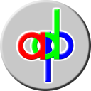
The rest of the colors are episodic. The exceptions are the ADP and SCP Policies logos, which use pure RGB color scheme components.
Default Lab logo
The main logo, inherited from one of the first projects, the ESHQ mod for Half-Life I, is two intertwined lines placed in a circle. The lines form a figure, which can be equally validly defined as:
-
DNA helix (where DNA is understood as the main biological information carrier);
-
scheme of tracks of subatomic particles in the Large Hadron Collider (one of the advanced tools for studying the foundations of the universe);
-
intersection of traffic paths (in the general sense);
-
a symbol of infinity with divergent ends of the loops.
The figure is tilted at an angle of 45°, which additionally forms the image of two separate loops facing in opposite directions. This interpretation is also valid.

There is a rather old video completely generated our tool FullSilence. It describes the concept of our main differentiator in a little more detail.
DPArray store logo
This symbol is a stylized ligature of the letters d and p, which corresponds to the name of the product
deployment system used – Deployment packages. The letters in the logo have a common vertical line formed
by four arrows alternately colored in emerald and silver.
The arrow is pointing down, similar to the common sign for downloading and installing applications on the device. A similar arrow pointing to the right is used by the products of the Laboratory when displaying the progress of performing resource-intensive operations.

This concept also has a video presentation.
Other products logos
Other products of the Laboratory use:
-
Similar to the main circle of silver color;
-
Half size main logo rotated 22.5° at the top of the circle;
-
An abbreviation of the product name at the bottom of the circle.

Exceptions are:
- Logo of ESHQ and ES: Randomaze modifications, which is similar to the main one, but with the emerald color replaced with charcoal;

- The logo of the uNot project, similar to the main one, but with the background circle replaced by a “cloud” of a pop-up message;

- Logos for ConcurrentDraw, Grammar must joy, One hundred and one and Thousand projects using their own sub-logos over the standard circle;


